Analyzing Throttle Data
How Analyzing Throttle Data Helps with Precision Driving
For driver development, the throttle, brake, and steering data traces are extremely important to look at in the data. The traces themselves provide a lot of information but I’m also going to highlight different ways of looking at the data as well as some math channels that can help us understand what is happening as well. Throttle data is useful for me with the driver development services that I offer here at Precision Driving Analytics. For this article, I’m just going to focus on one data channel – the throttle pedal.
The throttle pedal trace is always one of the first things I look at in data – especially if it is a new client. I’m looking for a smooth throttle application. If a driver is stabbing the throttle or is having to lift after going to some throttle then that tells me that they probably aren’t as patient with their throttle application as they should be or they are dealing with a handling issue.
Throttle Data from Sonoma Raceway
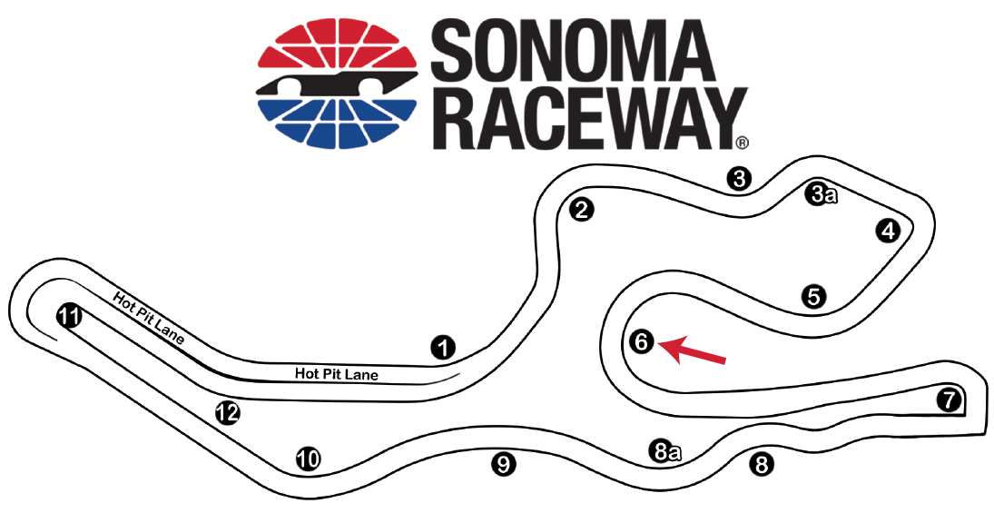
The track data that I’m going to looking at is from Sonoma Raceway which is a track that cars tend to have a lot of understeer at and patience with throttle application is key. These are two different drivers in the same kind of car. The red driver’s lap time was a 1:41.113 and the blue driver’s lap time was a 1:38.812. The corner that I’m going to focus on is Turn 6 as shown in the map below.
In Exhibit 1 are the throttle traces from both laps and I have identified the Turn 6 throttle traces.
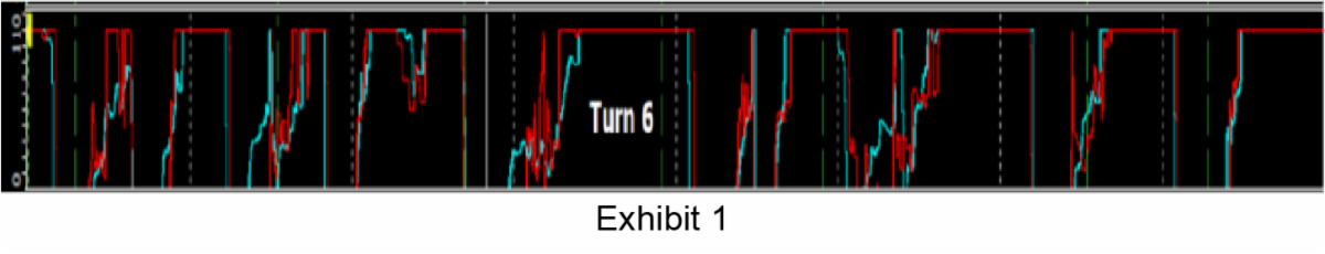
Exhibit 1
In general, the Blue driver has a smoother throttle application than the Red driver. One thing to keep in mind is that every time the throttle pedal is pressed and released weight is being transferred from the front to the rear of the car or vice versa. And the faster this is done, the faster the weight is being transferred.
What is Throttle Velocity?
A great way to see how quickly the throttle pedal is being applied and released is by looking at the throttle velocity. Throttle Velocity is a simple math channel that can be created by taking the derivative of the throttle pedal channel. Exhibit 2 shows a zoomed in view of the throttle velocities of both drivers in Turn 6. The spikes up are the speed of throttle application and the spikes down are the speed of throttle release. This really highlights the differences in how the drivers are using the throttle pedal. Not only was the Blue driver faster, but he also gained almost .2 seconds through this one corner.
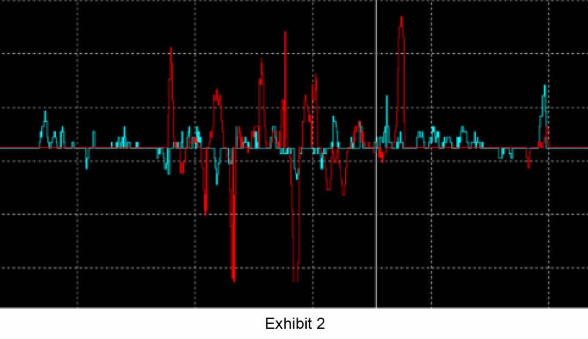
Exhibit 2
What is “Lifting”?
Now that we have throttle velocity, another math channel that I like to use is Lifting. Lifting can be defined as when the throttle velocity is negative. A simple IF statement can be used to identify this. The nomenclature changes from different data software packages but the objective is to provide a 1 every time throttle velocity is negative. I find that looking at this on a track report can also be very helpful. Exhibit 3 shows the throttle as a color channel on a track map of turn 6 as welling as the lifting from both drivers. The lifting is shown as the red lines that are perpendicular to the track edges.
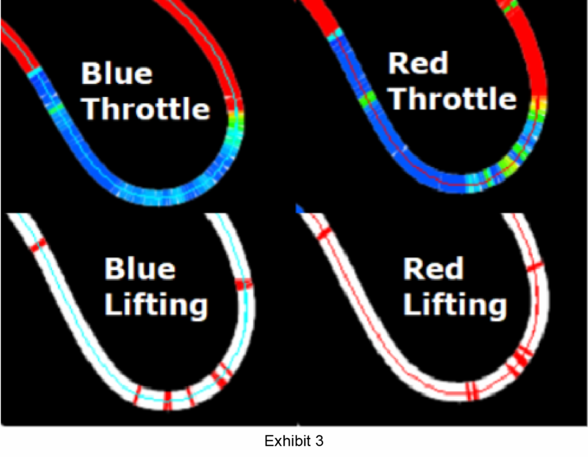
Exhibit 3
Certainly the Red driver is doing their share of lifting which indicates they are getting to a little too much throttle too early but their lifts are much more deliberate and slower which the thickness and uniform shape of the red lines shows. Since I was there with the drivers at Sonoma, the reason why both of them are lifting is because of the understeer that was developing. But the difference was that the Blue driver was anticipating it and trying to keep the speed of the weight transfer to a minimum.
But they also knew that some weight needed to be transferred to the front tires in order to get some more front grip and minimize the understeer. I will say that the Red driver did get to full throttle sooner as can be seen from the throttle traces in Exhibit 1 but the Blue driver got to some throttle sooner and this allowed him to be 6 mph faster in the middle of the corner. Exhibit 4 shows the speed traces of the two drivers through T6.
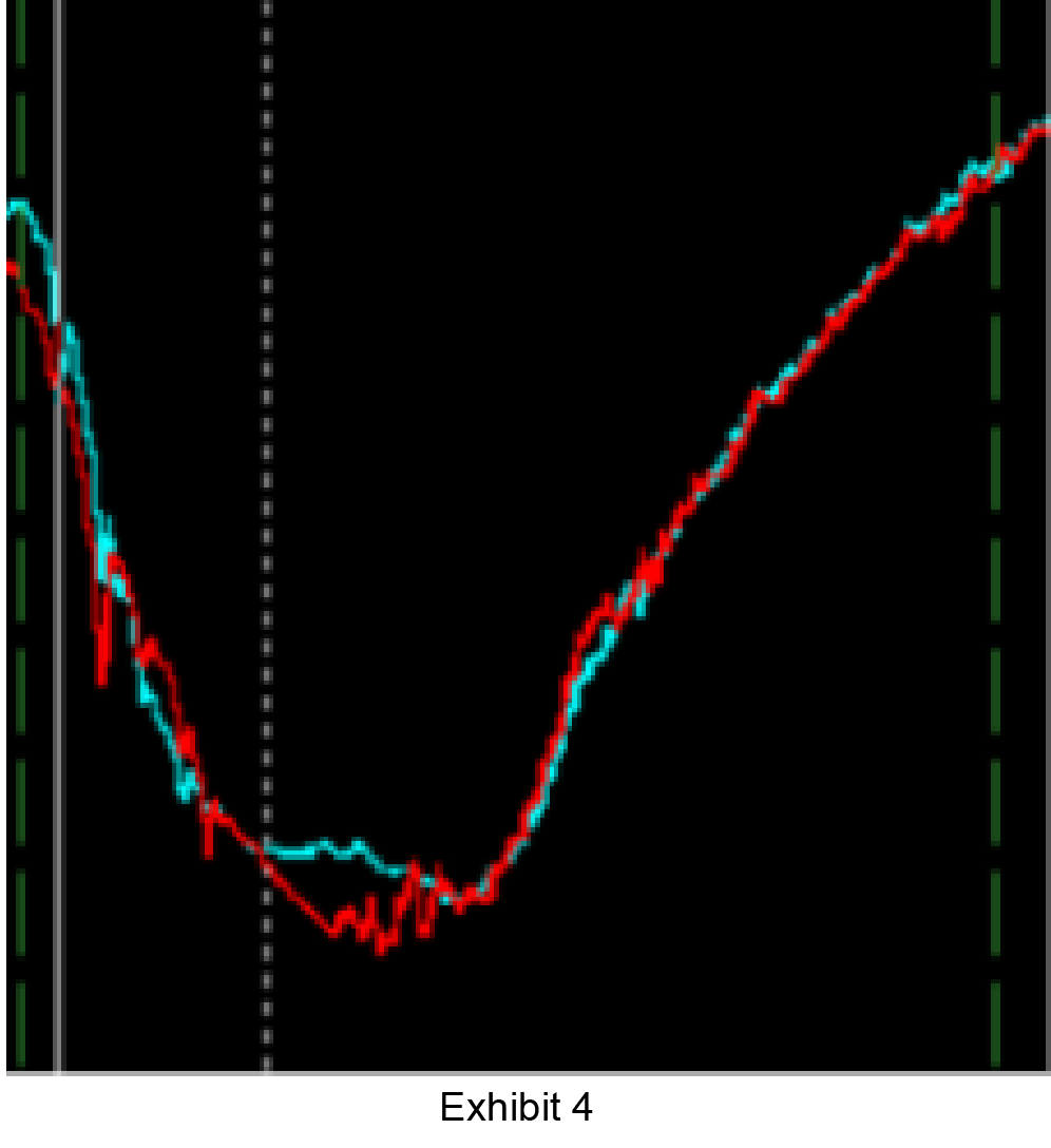
Exhibit 4
Another graph I really like to use when looking at throttle application is the histogram graph. This shows the percent of time that each driver is spending at different levels of throttle. Exhibit 5 shows this for the entire laps of both drivers.
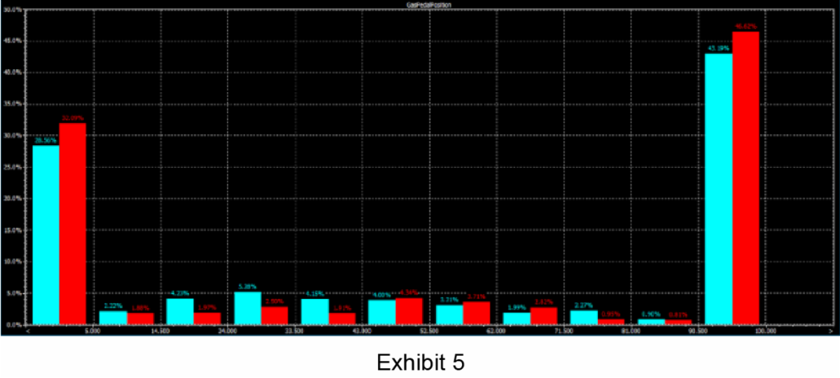
Exhibit 5
I have used this graph many times to help drivers go faster – usually with the goal of getting them to achieve 100% full throttle for a longer percentage of the lap. But in this case, the Red driver was at full throttle 46.62% of the lap and the Blue driver was only at full throttle 43.19% of the lap. Yet the Red driver’s lap was 2.3 seconds faster. How come? Well, first the Red driver was off throttle 32.09% of the time and the Blue driver was only off throttle 28.56% of the time. Interestingly, the difference between these two percentages is 3.53% and this is almost the same as the difference between the full throttle percentages which is 3.43%. But the Blue driver is also spending more time in the 5-40% range which signifies that he is going to throttle earlier but being more patient with throttle application.
This becomes even more important if I zoom into turn 6 and look at a Throttle Histogram for just that corner as can be seen in Exhibit 6.
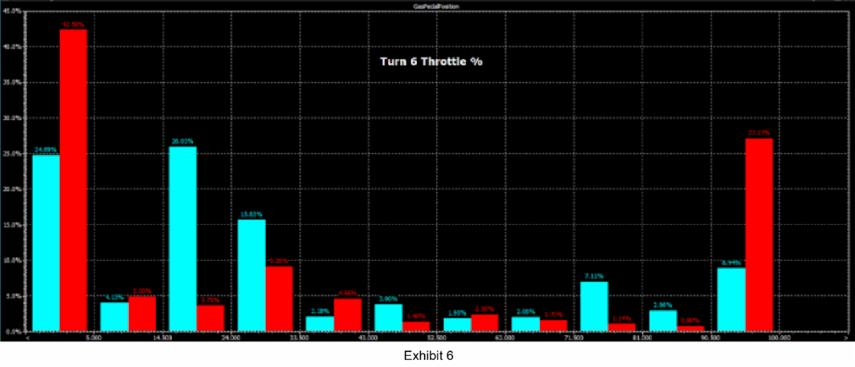
Exhibit 6
Get Professional Help with Driving Analytics
We are Precision Driving Analytics and we hope this helped you further understand the importance of analyzing throttle data. The next time you are driving your race car, really think about how you are applying and releasing the throttle pedal. Also, don’t forget to use these data analysis tools to better understand how your lap time is being produced!
Call (948) 257-0556 or click here to contact me today.